We checked over 20 contractor landing pages and found only 1 in 6 used it correctly.
Could this be why, according to insights from Impact, most landing pages convert around 2.35%? And why the top 10% cash in roughly 11.45%?
In this article, we’ll show you the inner workings of the highest-converting landing pages for contractors so you can:
- Do what matters to drive actual results
- Convert more instead of spending more on traffic
- Undo mistakes that are making you lose money
- Understand online buyers better and turn more of them into loyal customers
Let’s dig in.
What are Landing Pages?
In digital marketing, a landing page is the part of your website that the web traffic from a marketing campaign sees first.
Let’s paint the picture:
When you’re walking up a staircase and finally land on your destination floor, the area of the floor close to the stairs is the landing.
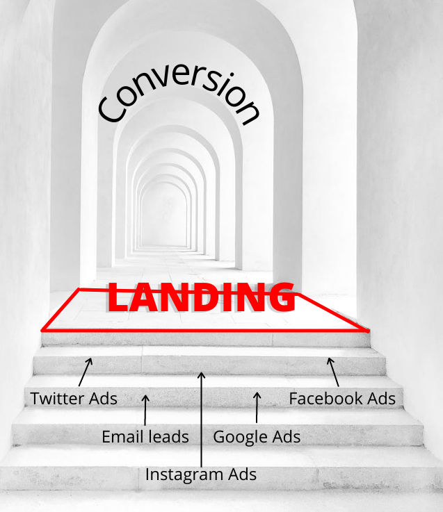
That’s what a landing page is to your web visitor: their first encounter with your website on their buyer’s journey.
Now, there’s often confusion over the true definition of a landing page.
While some people refer to landing pages as any entry point on your website, others narrow it further to those pages specially designed to convert traffic.
This could be a page designed to:
- Collect contact information
- Get people to call or chat with you
- Sell a service
- Register for a webinar
- Subscribe to your email list or newsletter
Landing pages usually have one goal. That’s not for convenience, although it is highly recommended.
And we will get into those details soon.
What Landing Pages are Not
Out of 24 landing pages belonging to contractors running marketing campaigns, only four contractors used them correctly.
If you want to make the most of your ad spend, you should avoid using just any page on your website as a landing page.
In internet marketing, landing pages are not just any entry point on your website. If you are going after higher conversions, you’ll need a dedicated page for your campaign. One that fits perfectly into what potential customers are most likely to respond to.
Let’s see how online buyers make their decisions to understand what they respond to.
Or skip to elements of high-converting landing pages.
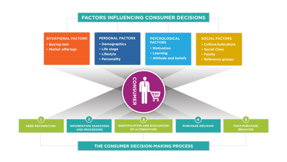
How Potential Customers Make Buying Decisions Online
Understanding how people make purchasing decisions will help you know how to put your business’s best foot forward and stand a better chance to convert.
This will improve the way you write your landing page copy and outline the page.
People are complex, and you cannot figure everyone out in a few paragraphs or an entire book.
What you can do, however, is make assumptions about consumer behavior.
The more you know about your customer, the more accurate the assumption, and the better your landing page performs.
Stage 1: Buyer is aware of a problem
Your potential customer faces a problem and searches for a solution. This is usually the first stage.
They could be facing a clogged toilet and quickly look for a plumber. Or they’re thinking of remodeling their kitchen and want to find out how to get started.
Recognizing the need for a solution starts internally (feelings or personal perceptions about a service) or externally (word of mouth or marketing). This is a problem-aware buyer.
Stage 2: Buyer searches for information
The next thing your buyer does is find out how to satisfy their need. Just like in problem awareness, it can be internal or external.
An internal information search is when they use personal experiences, while an external information search includes checking Google or asking a friend or an expert.
At this stage, the buyer becomes solution-aware. They are more likely to convert than problem-aware buyers.
Stage 3: Buyer looks for alternatives
Most people don’t go with the first solution they find. For instance, a buyer compares the price per square foot of house painters nearby.
What if there is a simpler process? What if someone else does an even better job?
The power of “what if” drives the search for alternatives. Here, your buyer can opt for another brand based on their individual taste.
Your landing page has to combat alternatives if you don’t want to lose to competitors. That’s why you need a powerful, unique selling proposition (USP) that clearly states why you’re a better option.
Stage 4: Buyer makes the purchase
After checking out their options and weighing them against logical as well as emotional factors, your buyer decides to buy.
This decision, however, doesn’t mark the end. People often put off purchases to a later date. It could be because of several objections; get ready to remove them.
For example, is the price too high? Offer a payment plan.
Is it too risky? Offer a money-back guarantee.
What if they’re not sure of what it will cost them? Let them request free estimates.
Did the competitor beat you on price? Push your benefits harder.
Stage 5: Buyer’s behavior after the purchase
After the purchase, they could either be satisfied or feel buyer’s remorse. You can make the most of both situations.
A satisfied customer can sing your praises through reviews or word of mouth. And this is valuable to your business. Make sure to collect these reviews for future landing pages.
As it sometimes happens, buyers may feel like they didn’t get full value for their money. They may not buy from you again. But find out why they feel this way and what would’ve made it a better experience for them.
Use this information to fine-tune your service or process.
Now that you understand online buyers better, what are the things on your landing page that matter to them?
Elements of High-Converting Landing Pages
Although these elements have various duties on the page, such as
- Attract and pull in the reader
- Get them excited about your service, and
- Show them you’re trustworthy
They all work together to make sure the conversion happens.
The Anatomy of a Contractor Landing Page
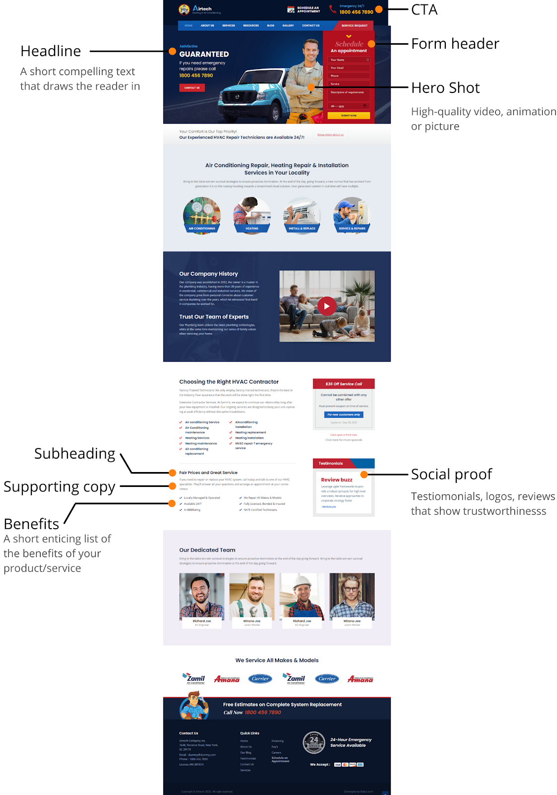
1. Headlines
A famous quote about headlines among marketers is this one by David Ogilvy, the Father of Advertising:
On the average, five times as many people read the headline as read the body copy. When you have written your headline, you have spent eighty cents out of your dollar.
Your headline is one of the most important parts of your landing page. You cannot afford to send this to the back burner.
When we talk about headlines, we’re referring to:
- The main heading at the top of the page,
- Supporting heading text or subtitle, and
- Subsequent subheadings in the body text
The main heading lets the reader know what the rest of your landing page is about. And it must match the ad copy that brought the visitor to the landing page.
Supporting heading text helps the main heading—which has to be concise—to pull the reader further down the page.
The subheadings in other parts give you page structure, bring out the main ideas, and make it scannable for busy readers.
Now, there’s a wrong way to go about writing this.
If you write your headlines and subheadings the right way, you’ll be able to:
- attract qualified buyers
- grip attention quickly
- lead to higher conversions
On the other hand, miswriting your headlines and subheadings will give you the opposite result.
Here are four important things to keep in mind for getting your heading right:
Make sure it carries your unique value proposition: This is what makes your brand or service tick. It is why you are a better option than your competitors for your ideal customer.
Your value proposition could be that:
- you only use eco-friendly or natural paints
- you’re veteran-run, or
- your customer service is the highest rated in your industry by a reliable source
Anything positive that sets you apart will do.
Example: Eco-friendly Pool Cleaning Services
Let it be benefit-based: People care about themselves. They’re not clicking your link to look after your business; they are looking after themselves.
If your headline doesn’t communicate a benefit they want immediately, your landing page is dead in the water.
For a landscaping landing page, you can say, “Finally, a Backyard You Can Be Proud Of”.
KISS: Keep it simple, stupid. There’s no need to get cute with the text. Simple words and short sentences will do. Be specific, remove fluff, and keep it short.
My favorite is “The #1 way to #2” by a brand that sells a product to help people poop better.
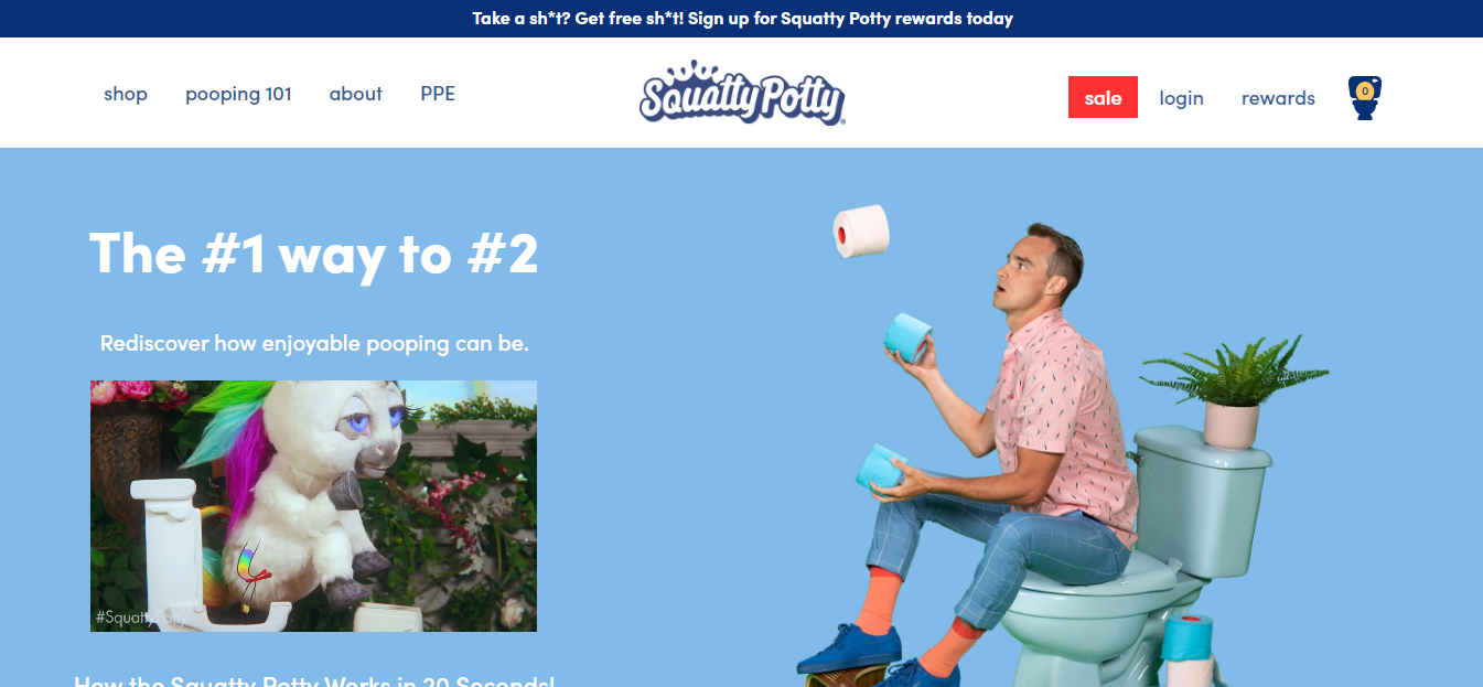
Source: SquattyPotty
Be compelling: Don’t make a declaration of a benefit and let it drop dead. Use your supporting heading text to compel readers to jump in on the offer.
An excellent supporting text for “Eco-friendly Pool Cleaning Services” could be:
“Many cleaning materials hurt your pool and our planet. We only use those products and methods that are great for the environment and your pool. And the result? The healthiest and cleanest pool!”
- Benefits
Realistically, most people won’t jump on the offer after only reading the heading. It would be best if you told them exactly why your service rocks.
That’s where benefits should come as the body text.
Benefits might sound like features. But they’re not.
Benefits show how features fit into the buyer’s lives to solve a problem.
Here’s an example:
Feature: Anodized aluminum construction
Benefit: Resists rust for up to 20 years
But it makes sense to put them together like so:
Resists rust for up to 20 years with an anodized aluminum finish
It’s standard practice to have these listed as bullet points. It helps keep your copy scannable.
Since benefits are major sales drivers, keeping them scannable helps your reader spot them easily and get convinced that your offer is the real deal.
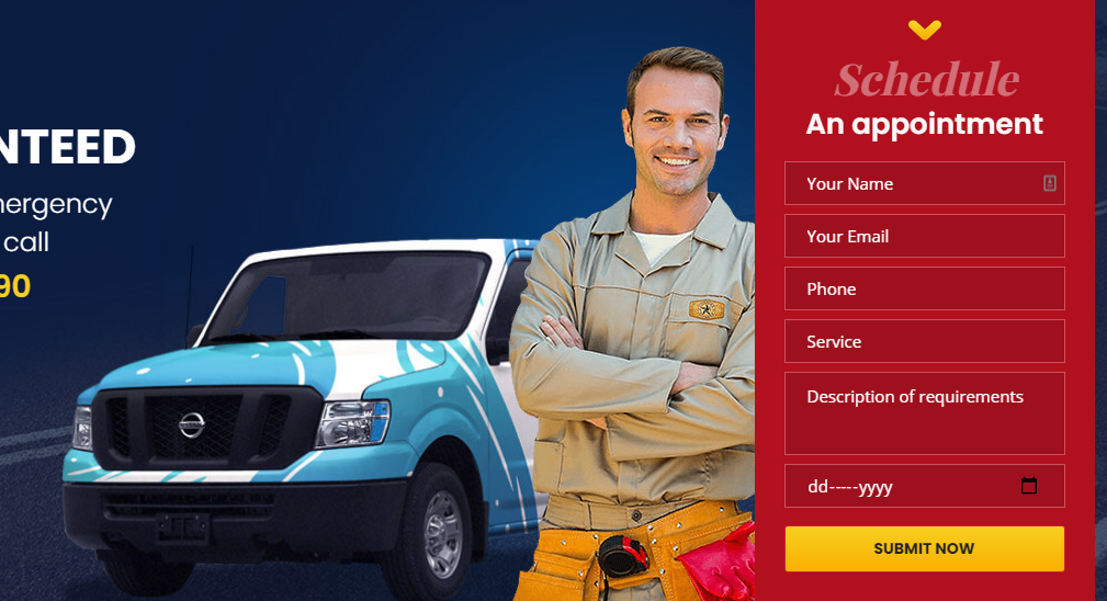
- Hero shot
A hero shot can be a video or image. This is priceless real estate on your landing page, and you can do great things with it.
Many people waste this space with stock images that people can easily spot as untrue.
Here’s what you can do with this space on a contractor landing page.
Show:
- Member(s) of your team carrying out the service you’re promoting (extra points if they’re smiling and wearing company uniform)
- A before-and-after shot of your service in action
- A professional picture of one of your best work (remember to ask your client if they’re okay with this)
- A high-quality professional video of work in progress, before and after video shots, or a positive customer review
4. Social proof
Social proof is the vote you get from people who put a stamp of quality on your service. It influences how people perceive your brand.
Say you went out to get a hotdog, and two hotdog stands are next to each other.
One has a long queue of people waiting to buy, and the other? Let’s just say there’s enough space to park a bus in front of it. Which one will you go for?
For your landing page to convert better, you have to show social proof. This could be:
- Reviews and testimonials from past customers
- Logos of brands you’ve worked for and with
- Logos of publications and news media you’ve been featured on
- Video testimonials
- Case studies
Why does this work?
Check the stats published on Hubspot’s blog:
- Logos of businesses on your webpage can boost conversions by as much as 400%
- A potential buyer will read 10 online reviews before deciding to buy
- 57% of customers only buy from businesses with at least a 4-star rating
- Call-to-action (CTA)
A Call-to-action is the defining factor that separates a landing page from other pages. A landing page has one CTA and promotes only one action.
Anything else is an undue distraction. And in marketing terms, it disqualifies the page as a landing page.
All the other elements on your landing page direct the reader to click this button. This moneymaker decides whether you’ve made a conversion or not.
So, a lot stands on it to be as precise, persuasive, and value-driven as your headline.
Avoid CTAs with boring texts that don’t give a hint of what’s on the other side.
“GET STARTED”, “SIGN UP”, and “SUBMIT” are not great CTAs.
Go with something that has a major benefit in it, for example:
- GET FREE ESTIMATE NOW
- SCHEDULE YOUR FREE 30-MINUTE CONSULTATION
- GET 30% OFF YOUR FIRST ORDER
Once you’ve got the basics down, you need to understand how to use them to create genuine success.
The Science Behind the High Conversion Rates
Conversions on landing pages happen when you’ve successfully convinced a lead to take an action.
You can’t do this without the power of persuasion. Persuading is the science of influencing.
When you understand how each element of your landing page plays out to convince the lead to convert, you can open up opportunities to test and optimize your conversions.
Enter the formula.
MECLABS Conversion Sequence Heuristic outlines five factors that affect conversions.
They put it together in a pretty formula.
C = 4m + 3v + 2(i-f) – 2a
Hold on.
Don’t get turned off by it. You won’t have to solve any math, we promise.
It’ll help you understand why your landing page converts and unravel how to improve it.
If you stuck around, here’s what that formula means.
Think of this as a checklist, not an equation.
Let’s lay it out:
C = probability of conversion
Because conversion is never certain, you can only increase your chances of making it happen with the rest of the formula.
The chances that you’ll convert a lead depend on the following:
m = Motivation of the lead
How badly do they want this problem solved? How strong or urgent is the demand for your solution?
Maybe yours isn’t a service with high demand or urgency. But you can influence motivation with your headline.
Make them an irresistible offer in your headline, use your subheading to stir up a desire for your offer, and sell your benefits with a more potent punch.
v = How strong your value proposition is
What is special about you? What can they get from you that they can’t get elsewhere?
You will need to communicate your value proposition in your headlines and body text. Let your visitors know what you can offer them that they can’t get elsewhere.
The stronger it is, the better.
Is it a 24/7 service? Transparent pricing? Satisfaction guaranteed?
Even donating 10% of your profits to a verified ‘save the planet’ project is an excellent value proposition that positions your brand as environment-friendly.
Just make sure it is true. Being dishonest about your value proposition can burn your brand.
f = Friction, how smooth the sales process is
What, other than cost, will potentially stop your lead from making the purchase? Find ways to smooth or remove it, no matter how small it is.
One excellent way to remove friction is by including multiple CTA buttons on the landing page. One CTA button should always remain at the top right corner of the screen.
So if at any point while reading your page, your reader decides to move forward, they don’t have to go through the trouble of scrolling and searching for the button.
If the quickest way to get to you is a phone number, make that easily visible at the top and clickable.
To make your number clickable, add the hypertext link “tel:XXX-XXX-XXX” where the X’s are the digits of your phone number. This way, your lead on a mobile device can immediately place a call with one tap.
Add a live chat option to the page if they prefer to chat online instead of talking on the phone.
Also, if it’s not an urgent service and you’re collecting contact info, keep the form short and only on essentials. It should be easily accessible.
What about scheduling an appointment? Give customers the ability to do it right on the page without registering elsewhere.
a = The reader’s anxiety in the process
Your ideal customers may be worried about your competence, their safety when working with you, and how fast you’ll get the job done.
“Am I wasting my time talking to these guys?”
“Will my family be secure if I invite these strangers into my home?”
“Can these guys even do what I need help with?”
You have to address these concerns in a simple and accessible manner.
This is where the social proof element comes into play and helps reduce anxiety. For your page, for instance, you can display your great reviews on Yelp or Google.
Listing out your services, featuring samples of previous work, and displaying a high-quality hero image or video of your team are fantastic ways to calm your target customer’s anxieties.
i = Incentives that lubricate the process and remove friction (because friction can never be zero)
Make the lead see that there’s so much benefit that it offsets the difficulty of getting it. Offer discounts, give them coupons, or provide special offers.
You can amp up the incentives by making them only valid for a certain time duration.
Here’s an example: 20% discount on HVAC repairs if they book an appointment before a 1-hour countdown timer hits zero.
A successful landing page completely satisfies this formula. It helps to start your project by writing out how you plan to address each factor in this checklist formula.
How to Create High-converting Landing Pages for Contractors
Here is the easy step-by-step process for creating highly converting contractor landing pages:
- Set your goals
Before you start designing a landing page, clearly outline what the goal of the landing page is.
Is it to:
- Grow your email list
- Get people to call for an estimate
- Sell more of your service during a promo?
Whatever the goal is, make sure it is specific and measurable.
- Gather information about your target audience
If you don’t know your ideal customer as well as a marketer should, you won’t be so successful selling to them.
What’s their most significant problem that you can solve?
What outcomes do they expect from services like yours?
What’s their income range?
Ask the questions that’ll affect how you speak to them. And try to find the answers.
You can interview past customers to find out what it is about your service that attracted them.
Or mine your reviews and testimonials for that priceless information.
- Figure out your Unique selling proposition (USP)
Without your unique value, you’re just another brand or service provider.
All businesses need a clear value proposition to survive in a sea of options at your customer’s disposal.
So, what’s yours?
Is it cost, quality, customer service, offering emergency service, etc.?
With this, cost-conscious customers can go with the brand whose value proposition is that they’re the cheapest option on the market.
And someone who is customer service conscious will be willing to spend a bit more to get that customer service.
The business that knows they rely on customer service to charge higher prices needs to mention they offer impeccable customer service. That’s their value proposition.
Note: Mining customer reviews, and testimonials in (2) above can help you figure yours out.
4. Outline your landing page
Draw the bare bones of your landing page on paper. Like this:
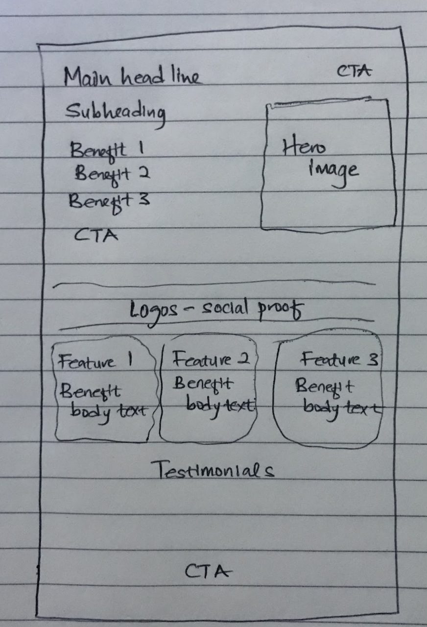
Give yourself a rough idea of what goes where. But you don’t have to do that without first taking a look at some of the best landing pages in your industry.
Depending on what service you’re using to build your landing page, you may be starting from scratch or using a template.
Whatever the case may be, start with an outline. That way, you’ll know what to look for.
- Write your landing page copy
With the full knowledge of your service at your disposal and understanding of your customers, you can sit down now and put your fingers to the keyboard.
Don’t make the mistake of editing yourself while writing.
Drop all your ideas on the page first, then use this checklist to edit:
- Grammar error-free
- Written in plain, simple words and sentences
- Sounds human
- No fluff (no unnecessary words and phrases)
- The headline attracts attention
- Subheads address the benefits
- Suggests urgency
This is a simplified breakdown of the editing process. If in doubt, hire a copywriter who understands your niche.
- Craft your CTA
Think of your CTA button like a knife’s edge with a ruler balanced on it. On one end is your lead; on the other end is the value you provide.
You have to put more weight on the value end of the ruler to get the lead to roll down to that side. That’s the conversion.
And it won’t happen if your CTA is weak.
Figure out the best way to persuade them to click and communicate it clearly and succinctly.
A simple way to do that is to add your significant benefit to the CTA (as we mentioned in the sections above).
Example: “GET YOUR 50% DISCOUNT NOW”
- Design your landing page and publish
Now that you have everything on paper, it’s time to turn it to design.
But before designing, make sure you’ve chosen the images or videos you’ll use on the page.
One important thing to note about using videos:
“When you do videos, what you’ll find is it can sometimes decrease your conversions, but the quality of the customer that you end up generating is much much better, and they tend to spend more over the lifetime value” – Neil Patel
Completing this step can be extremely easy if you’re working with a template or a drag-and-drop landing page builder.
When you’re done, all you have to do is merge the page with your website domain and drive traffic to it.
On the other hand, if you’re not familiar with web design, it’s best to have a professional web designer work with the drafts you made.
Make sure to preview it first, and be sure the links work as intended.
Excellent Examples of Contractor Landing Pages
Now it’s time to check out some great examples to inspire your landing page creation process.
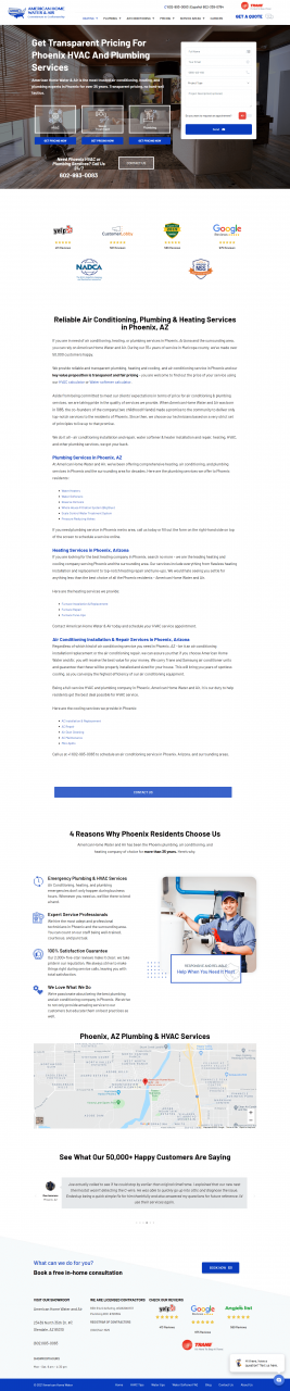
- American Home Water has demonstrated a powerful USP that doubles as benefits
American Home Water is our HVAC client. We helped get their revenue up by 32% in one year. Read the case study here.
Check it out:
2. Dazzling Cleaning’s impressive use of social proof as the headline

Click here to view the full landing page.
3. CertaPro Painters show an example of a great hero image
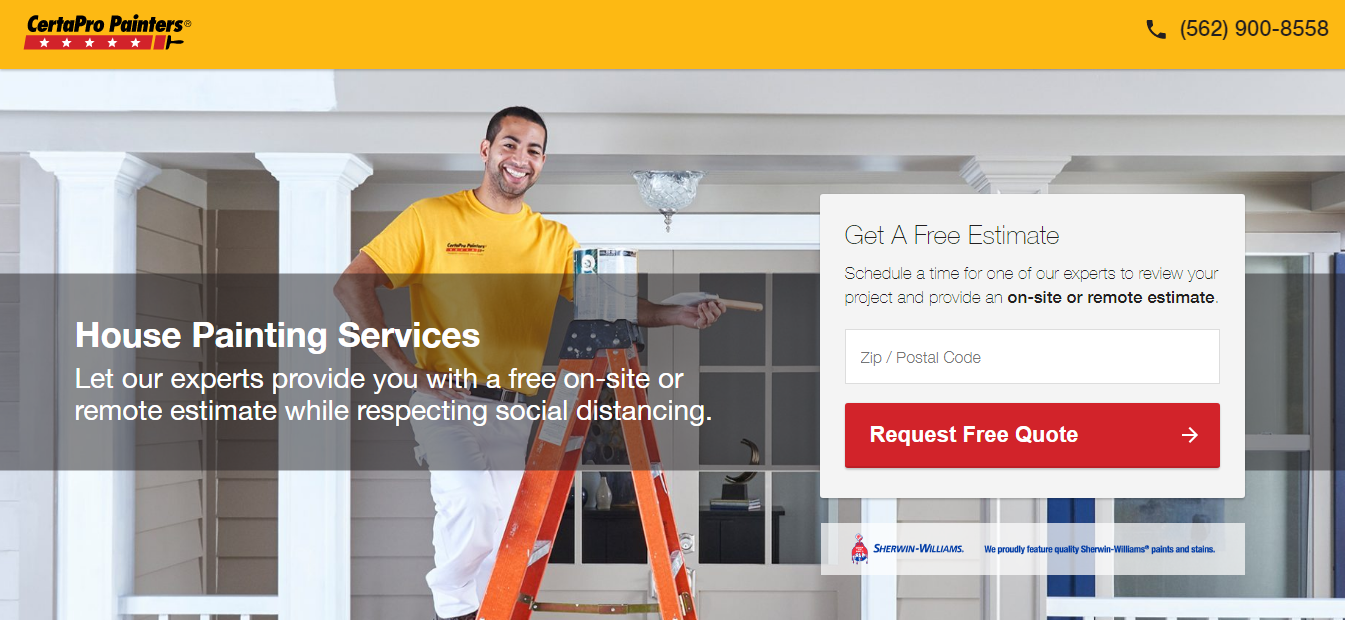
Click here to view the full landing page.
4. TruGreen’s landing page is neat and uses testimonials next to their CTA

Click here to view the full landing page.
5. Biltright construction grips attention with their headline and offer

Click here to view the full landing page.
Key Takeaways
The building blocks that hold up a successful landing page are:
- A strong and compelling headline
- Sizzling benefits
- An attractive and illustrative hero shot
- Undeniable social proof
- An inviting CTA
Put all these elements together to create a high-converting landing page in seven steps:
- Set your goals
- Gather information about your target audience
- Figure out your USP
- Outline your landing page
- Write your copy
- Craft a strong CTA
- Design your landing page and publish
If you enjoyed this article, join our private Facebook group where we share more valuable content and actionable tips to help you succeed in your internet marketing efforts.
Now, your turn:
What’s the best landing page you’ve ever seen? Please share it with us in the comments below.